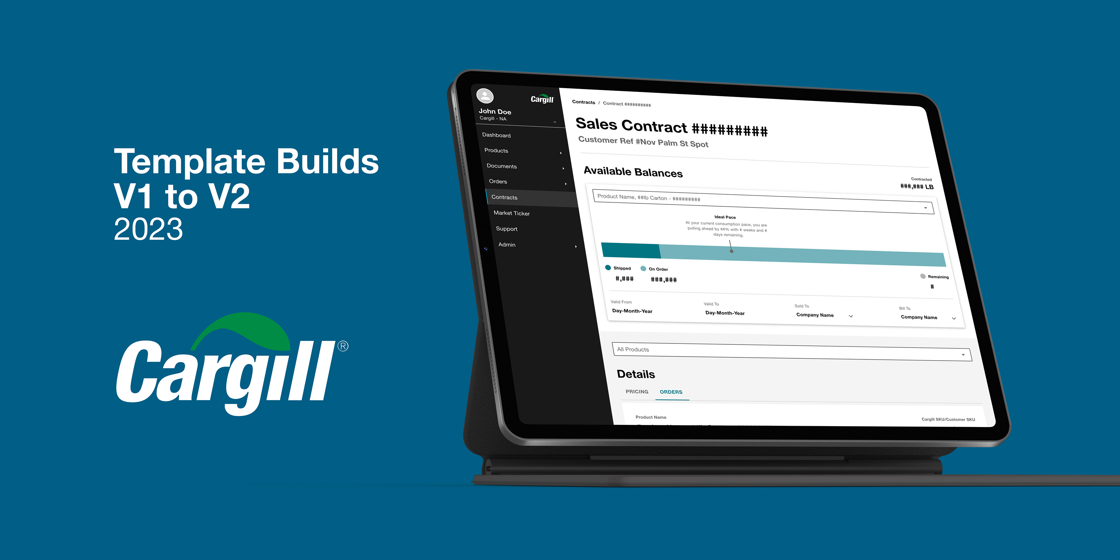
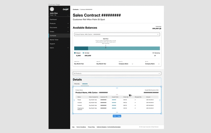
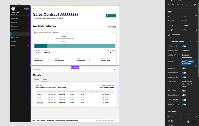
For four months, I was engaged with the Cargill design practice team to work on the company design system used by 50+ designers globally for stakeholders & customers. Version one of this design system lacked intuitive components & brand styling consistency, which in turn made the old Cargill UI design process slow, inconsistent, & outdated. Hence, the primary goal of this project was to develop & establish a new & improved version two design system library of reusable UI templates in Figma that are stylistically predefined, scalable, customizable, & quick + easy to use.
Leveraged Figma Tools + Template & Component Builds
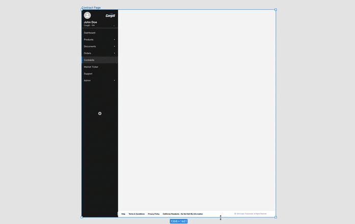
Constraints
By applying constraints, certain components are locked into place, without the need for sacrificing template scalability.
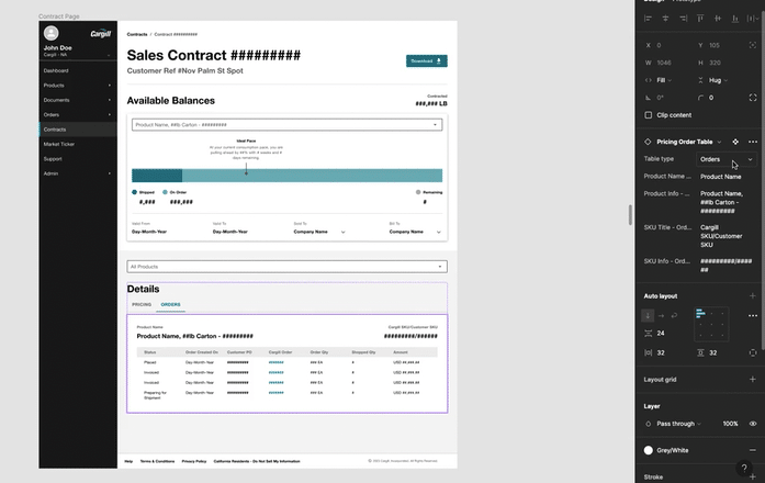
Auto Layout + Atomic Design
Templates & components are constructed with a thorough auto layout + atomic design build foundation. This dynamic design approach allows for quick & easy component adjustment, while simultaneously maintaining all template elements perfectly aligned & appropriately spaced.
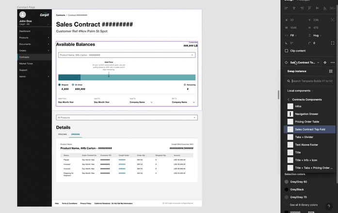
Instance Swap Property
All design system components are easily accessible & interchangeable with the embedded instance swap property.
Variant Property
Component variants are quickly accessible in the embedded variant library to allow for instant component version pivoting.
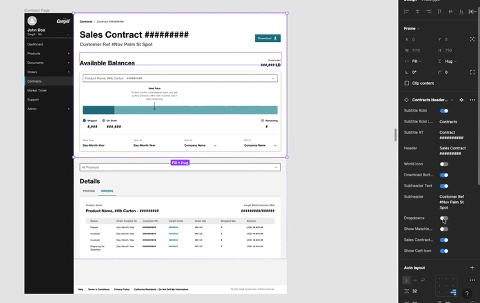
Boolean Property
Extraneous components + any other elements such as buttons & icons can be easily shown or hidden with a simple flip of a switch.
Text Property
Text is easily editable without the need to go through the tedious process of finding & selecting individual layers or text boxes to make changes.

